
©2026 Daniel Cranney
There's a real art to how you use modals, pop-ups, lightboxes, flyouts and dialogs in your applications.
When they're done well, they're a great way to prompt a user for an action, remind them of something important, announce something, pass on warnings and a lot more. When they're done badly, they can be intruisive, irritating, ugly, and inaccessible.
In this article, I'll show you how we're used to working with popovers, and how the Popover API becoming baseline has simplified things.
For a while these kinds of elements have been clunky to use in the context of a framework (in my case, Next.js). In general, the setup goes something like this...
import { useState, useEffect } from "react";
export default function PopoverComponent() {
const [isOpen, setIsOpen] = useState(false);
useEffect(() => {
function handleClickOutside(event) {
if (popoverRef.current && !popoverRef.current.contains(event.target)) {
setIsOpen(false);
}
}
if (isOpen) {
document.addEventListener("mousedown", handleClickOutside);
}
return () => {
document.removeEventListener("mousedown", handleClickOutside);
};
}, [isOpen]);
return (
<div>
<button onClick={() => setIsOpen(!isOpen)}>Open Popover</button>
{isOpen && (
<div className="popover">
<p>I am a popover. Click outside to close.</p>
<button onClick={() => setIsOpen(false)}>Close</button>
</div>
)}
</div>
);
}
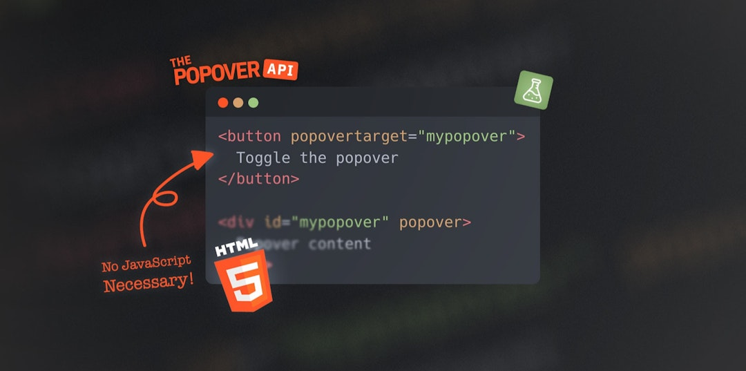
Now that the Popover API has become baseline, you can do this in a much simpler, more concise, more robust way:
<button popovertarget="manual-popover">Open Popover</button>
<div id="manual-popover" popover="manual">
<p>This popover won’t close automatically.</p>
<button popovertarget="manual-popover" popovertargetaction="hide">
Close
</button>
</div>
...And that's it.
✅ Light-dismiss is rolled in
✅ The popover attribute can be set to auto, manual or hint
Give it a go in one of your projects, and let me know what you think on socials.
©2026 Daniel Cranney